Design System
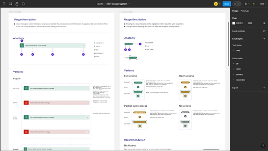
A design system consolidates rules, guidelines, components, and tools, aiding teams in crafting unified user experiences. It acts as a definitive guide for design and development, ensuring consistent visual appearance, behavior, and functionality across a company's digital assets.
Role: UX & UI Designer
Year: 2022
Tool: Figma
UX/ UI Methodologies & Techniques
Specific components User Research
User-centric design approach
Design Principles
Accessibility consideration
Documentation and Training
The Challenge
The Benifits
-
Central hub for components, patterns, and styles in one place.
-
Enables efficient redesign and management of project changes at scale.
-
Allows design resources to tackle complex issues, maintaining visual and functional consistency.
-
Rapid replication of designs using pre-made components.
-
Minimizes redundant work, promoting consistency and efficiency.
-
Cuts down wasted time due to miscommunications in design or development.

_edited.jpg)

-
Starting afresh for each project or phase led to repetitive creation of component libraries.
-
Despite style adjustments, similar components were remade.
-
Our goal was to duplicate previous components and document past uses, tailoring specific use cases for each component.
The Approach
We started with creating a style guide for the system from scratch.
_edited.jpg)
_edited.jpg)
_edited.jpg)