
Project
To Re-design "Turmeric n More" website a Seattle based door-to-door food delivery website.
Problem
The website needed an overall update for their customers. The website was content heavy and needed a clean and clear navigation pattern which could lessen the customer's cognitive load and help order the food easily on "Turmeric n More" website.
Summary
Existing website was content heavy, the goal was to use visual strategies to effectively communicate the content in the most minimal possible way in order to do this, I analyzed the main menu content of the existing website and re-organized the information architecture to create a definite user flow. Worked on the grouping (Images and content)
Task
Analysis | User Research | User Experience Design | Interaction Design | Visual Design | Ideation/Sketching | Prototyping | Usability Testing | Documentation | Iteration
COMMUNICATION GOALS
Existing website was content heavy, the goal was to use visual strategies to guide the process of effectively communicating the content in the most minimal possible way
Logo Creating Process : Rough Sketches
Logo Creating Process : Rough Sketches


Old Logo
Old Logo

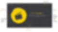
New Logo
New Logo

Website Re-designing Process: Rough Sketches
Website Re-designing Process: Rough Sketches


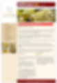
Old Website
Old Website


New Website
New Website

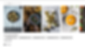
Old Menu
Old Menu

New Menu
New Menu
COLOR PALLET
COLOR PALLET

TYPOGRAPHY
TYPOGRAPHY

Additional Information
Additional Information

REFLECTION
Hierarchy
Logo and Tur-mer branding :
Scale: as a visual tool to demand more attention from the user in terms of visual hierarchy.
Color: Used yellow as my base color taking inspiration from Turmeric as yellow is a bright color that can be associated with something fun. Since the goal of this project was to create a bold and engaging experience, the VCD was to use a high contrast color to add personality. The usage of text color, white and yellow acts as a hierarchy to meet the goal of this project.
Font: Used Indian inspired font and played with font size
Created Emotions
Created an emotion by having creative branding strategy on the landing page “Tur-mer on”